import React from 'react'
import {render, screen} from '@testing-library/react'
import '@testing-library/jest-dom/extend-expect'

//👇 Imports a specific story for the test
import {Primary} from './Button.stories'

it('renders the button in the primary state', () => {
  render(<Primary {...Primary.args} />);
  expect(screen.getByRole('button')).toHaveTextContent('Primary Button');
});
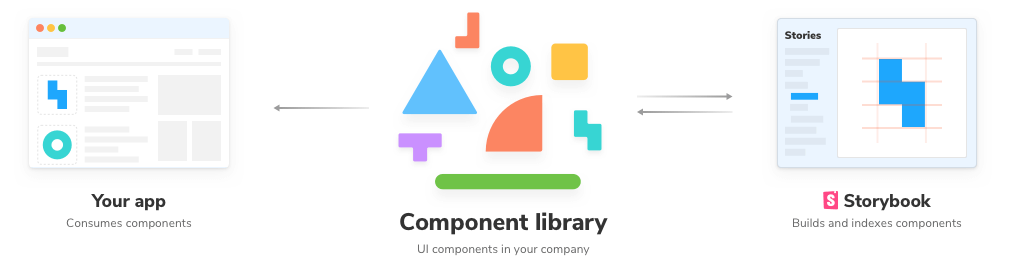
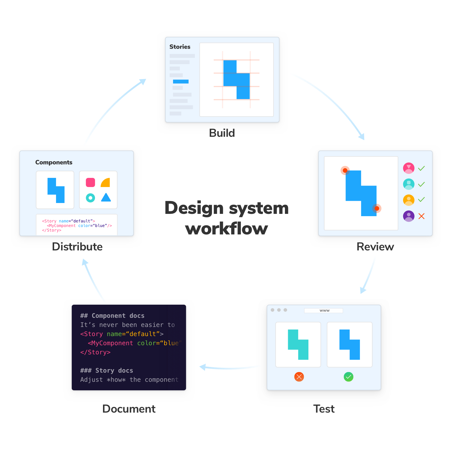
Visual Testing with Storybook
Visual Testing with Storybook
import initStoryshots from '@storybook/addon-storyshots'
import {imageSnapshot} from '@storybook/addon-storyshots-puppeteer'

initStoryshots({
  suite: 'Basic storyshots',
  test: imageSnapshot({storybookUrl: 'http://localhost:6006/'})
})
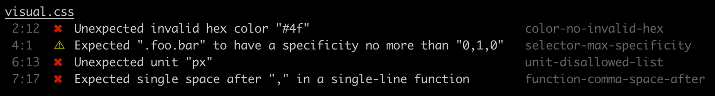
Pixelmatch vs SSIM
Visual Testing with Storybook
describe('<Button />', () => {
  ...
  it('check content after clicking', async () => {
    // navigate to story
    await page.goto(
      'http://localhost:6006/iframe.html?id=components-button--primary',
    )
    // click on the button
    await page.click('button')
    // take screenshot and compare
    const screenshot = await page.screenshot()
    expect(screenshot).toMatchImageSnapshot() // import {toMatchImageSnapshot} from 'jest-image-snapshot'
  })
})


